
The workspace you design around yourself influences the work you produce. For designers, writers, and creative professionals working from home, the visual environment is not decoration. It is infrastructure. Botanical wall art introduces organic form, color restraint, and visual rest into spaces that otherwise trend toward screens and clutter. This guide covers practical approaches to selecting, sizing, framing, and placing printable botanical compositions in your home office.
Why Botanical Art Works in Workspaces
Natural forms carry properties that digital interfaces lack. Curved petal edges, irregular leaf veins, and soft tonal gradations give the eye a place to rest between periods of focused screen work. Research into biophilic design consistently shows that exposure to natural imagery reduces cognitive fatigue and supports longer concentration spans.
Unlike live plants, which require maintenance and appropriate light conditions, printed botanical art delivers these benefits without ongoing demands. A well-chosen print becomes a fixed point of visual calm in a dynamic workspace. It does not require watering, pruning, or relocation as seasons change. The image remains constant, providing a visual anchor that supports routine and rhythm.
Sizing and Scale for Maximum Impact
For a standard desk-facing wall, a single large statement piece between 24 and 36 inches wide creates a visual anchor. If your wall is wider than six feet, consider a diptych or triptych arrangement. Two or three related botanical prints with consistent spacing between them read as a single visual unit. The eye travels across the series as it would across a single wide composition.
For smaller spaces or walls broken by windows and doors, a series of smaller prints in identical frames creates rhythm without demanding dominant wall space. Standard sizes like A3, 11 by 14 inches, or 12 by 16 inches work well in these contexts. The repetition of frame style unifies disparate locations into a coherent visual statement.
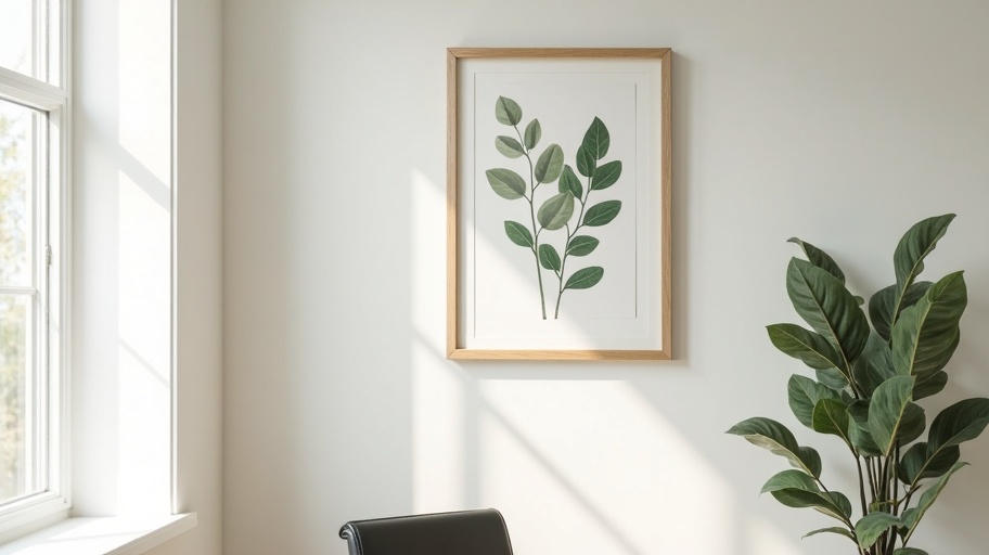
Framing Recommendations for Different Aesthetics
The frame is part of the composition. For a minimal, Scandinavian-inspired office, choose thin natural wood frames with no mat, or a single clean mat border in off-white. The frame should disappear and let the botanical subject command attention. Oak, ash, and pale maple complement the muted greens and ivories typical of botanical subjects without introducing visual competition.
For a more traditional or maximalist space, ornate vintage frames in gold or dark wood add weight and historical resonance. The contrast between a contemporary botanical print and an antique frame creates visual tension that draws the eye. This pairing works particularly well in offices that already contain vintage furniture or reference materials with aged patina.
For the most minimal approach, skip the frame entirely. Print on heavyweight textured paper and mount the print directly to the wall with archival adhesive corners or Japanese washi tape. This creates an informal, studio-quality presentation that suggests process over product. It suits workspaces where the creative work itself is the primary decoration.
Pairing Botanical Prints with Sacred Geometry
The combination of organic botanical forms and precise geometric structure creates a balanced visual conversation. Place a botanical print beside a golden ratio spiral or Flower of Life diagram. The irregularity of the plant form contrasts with the mathematical certainty of the geometry. Together they suggest the full spectrum of natural order, from organic variation to structural law.
Our Sacred Geometry Botanical Fusion Pack includes compositions specifically designed for this pairing. Each botanical element is built on a geometric grid, so the relationship between organic and mathematical is embedded in the file itself. These prints read as botanical art at normal viewing distance and reveal their geometric construction only on closer inspection.
Placement Strategy for Home Offices
Position your primary botanical piece in your direct line of sight from your working position. This ensures you receive the visual benefit during the majority of your workday. Avoid placing art where screen glare will obscure it. Test the location at different times of day, since natural light changes direction and intensity.
If your desk faces a window, place botanical art on a side wall. The natural light will illuminate the print and reinforce the connection between the depicted subject and the living world outside. Avoid hanging prints directly opposite windows where backlighting will flatten the image and reduce its visual presence.
Printable vs. Physical Prints
Printable files offer control over paper choice, print size, and finish. You can print on watercolor paper for a textured, artistic feel, or on smooth fine art paper for precise detail reproduction. You can reprint if colors fade or if you move to a new space with different wall dimensions. The initial investment covers every future output.
Physical prints purchased from a gallery or print shop offer convenience but limit your options. With printable botanical wall art, you invest once and output as needed. This is particularly valuable for designers who refresh their workspace frequently or who want to test different sizes before committing. Print a draft at standard letter size, live with it for a week, then commit to the final large-scale print.